Wednesday, August 27, 2008

"Erik" step-by-step

Here's "Erik", from my previous post, showing the sequence of the painting process. I first covered the canvass in a middle tone hue, and then started the highlight hues. Next came some dark tone hues followed up with some middle tone hues. Next I began bumping up the warm and cool colors, followed by lots of didling until I was satisfied with my colors and rendering of the facial features. Like I said in the previous post, I still haven't got this medium in my bones yet. I have only painted seriously in acrylic for about 4 years, but I do a lot of it and therefore am progressing apace.

Two Acrylics On Canvas Using "Golden Open"

These paintings (two bottom photos) are on 11"X14" stretched canvases. They were painted with extra long drying Golden Open acrylic paint. With me, the longer drying time is neither here nor there, because I paint fast, and I don't want that fine blended look like Jeremy Lipking masterfully does. I do have to wait for my large undercoats to dry somewhat. This is good, because it slows me down. I can "live" with the painting longer and evaluate it with fresh eyes. "Stacy" was painted with a 5 traditional color set of titanium white,alizarin crimson hue, ultramarine blue, vandyke brown, and sap green hue. "Erik", who lives in an apartment over my studio, was painted with the same colors with an addition of cad. red light, and cad. yellow light for a little extra pizazz. I haven't yet got the feel in my bones for acrylic portraiture, but by looking and being inspired by a few artists such as Sandra Flood and Karin Jurick, I will prevail! I'm getting ready to teach another watercolor portrait workshop in Sept., so I painted "Erik" again (top two photos) on 140lb., non- stretched, cold press watercolor paper...sooo much faster in watercolor. No wonder watercolor was used in the past as a study medium in preparation for final oils.

Thursday, August 21, 2008

Can You Name This Lighthouse?

This Wednesday I gave a private acrylic painting lesson at my studio. My student's name was Heather, a twenty something with a very good drawing ability. We sat side by side at our easels and painted. Heather brought a photo of a lighthouse that she pulled off the web. Pretty boring image and at first blush, and I didn't want to use it as our painting reference. But I thought better of it, because as we all know, a photo reference is but a stepping stone to a good painting. We practiced a lot of color mixing and paint application. We used traditional Golden brand acrylics (not their new and wonderful Golden Open) with a limited palette of Cad. yellow light and med., cad. red light and med., pythalo (spelling?) blue, cobalt blue, yellow ochre, burnt sienna and a touch of bone black. We got about half way through at the end of our two hr. session. We painted somewhat close to the colors in the photo, because I wanted Heather to get the experience of mixing and duplicating the colors that she was seeing. Heather did a great job mixing and applying paint to canvas and is now off on her journey to mastering the medium. I spent time today, completely changing the atmosphere of this scene and bringing the painting to a completion. Am I happy with the result? I think so. I"ll look at it again in a few weeks. The USA men's and women's Olympic relay teams laid two fat eggs in the Bird's Nest tonight! 10:30PM Pacific Standard time on Friday: Heather just emailed me her finish (top painting)...not bad!

Wednesday, August 20, 2008

I'm as mad as hell and ain't gonna take it no more!

Tonight, on the Olympic television broardcast, we get served up a f---king gymnastics GALA!!! Gala!? We don't want to see any other Olympic venues!? They are of no interest whatsoever!? Guess not! Must be a slow day or maybe the rain has cancelled ALL other events? Not to worry...we get MORE gymnastics! Indeed, the men's and women's competitive events were all very exciting, and don't get me wrong, my wife and I throughly enjoyed every morsel, but enough is enough!...we don't need no stinkin gymnastics gala! Did ya hear that? It was the click of my remote turning off the boob tube. Sorry. I needed to let off some steam, and I figured, why not on my blog! Are any of you blogsters out there with me on this on- air travesty? My next post will be art related again. Take this as just a small hiccup...or maybe a big finger! PS: The Jamaican's secret? Yam eating!!

Friday, August 15, 2008

Dark Visions

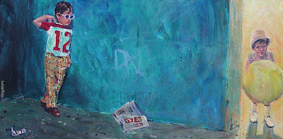
Years ago, when I was a young whipper snapper and wet behind the ears, I would walk the streets of LA with my Nikon F and document things. I will sometimes go into the Lobenberg archive and pull out one or two of my odd shots to use as reference for a painting. To the left and out of sight was a hot dog window (these were photos I snapped at the Pomona State Fair during the summer with smog to rival Bejing). This little boy was waiting for his parents who were purchasing some dogs. The little girl was from another shot. I felt that she should be coming around the corner in my painting. I also added the debris on the ground and my initials on the wall. What does it all mean? I haven't a clue. Can a few of you out there in the blogisphere clue me in?

Tuesday, August 12, 2008

Sisters By The Sea Numero Dos

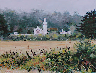
In many of my workshops, we start out with my contour drawing that I make copies of and have my students transfer to their watercolor paper or canvas using Saral art transfer paper. My emphases is on painting technique and color mixing, not drawing. Last Saturday's acrylic landscape wrkshp. was the "Sisters By The Sea Sanctuary". Not only are my workshops part of my revenue stream (thought I'd throw in a little business speak), but they allow me a great opportunity to do multiple studies. I do a painting, whether portrait, still life, landscape, or abstract before my workshop in order to work out how I am going to teach. Then at the workshop, I do the painting again as my students follow my a step-by-step painting sequence. The final paintings either go to my galleries or end up in my annual holiday studio sale in December. So here is my workshop iteration that I believe is an improvement on my first painting. I like the softer middle and backgrounds, the less fussy ochre field, and the less fussy yet more dramatic (in terms of light against dark tones) foreground. Overall this painting has more depth, because the middle and backgrounds are lighter and less rendered as compared to the foreground fence and brambles.

Wednesday, August 6, 2008

Sisters By The Sea

This acrylic painting is of the Carmelite Sisters By The Sea Sanctuary just outside Carmel, California and off Highway 1 which runs the lenght of the California coast. The overcast, maritime, cloud layer was kissing the top of the hills behind the sanctuary. I'm always struck by the serene beauty of this edifice surrounded by a golden field of grass and verdant hills. This scene was painted on a 12"X16" Belgian linen board. I will be teaching about 18 workshop students how to paint this starting with very broard shapes of color and tones to final refinements. The workshop is this Saturday at University Art, an art materials store here in Sac. town with a fantastic upstairs studio with north light exposure no less!

Saturday, August 2, 2008

How to rid yourself of that pesky and dangerous traffic

You have parked on a country road and have set up your easel for a few hours of uninterrupted painting. What to do about the occasional car, school bus, ambulance, big rig, tractor, combine, police or fire vehicles, etc.? Marco knows what to do!

Friday, August 1, 2008

A Patchy Fog and Overcast Day Near Carmel

What a mini vacation my wife Cheryl and I had! Patchy fog and overcast most every day. Hey!...we HOT interior valley Californios appreciate this type of weather...viva the coast of California where it can be cold and wet during the summer. The word "mini" in the sketch is shorthand for our Mini Cooper.

En Plein Air Ink and Color Wash Sketches

Remember Cinerama filmed in Cinemascope?... the loooonnnng screen movies of the mid and late 60's and maybe going into the early 70's. Well Strathmore has come out with a 6"X18" watercolor sketch pad...just like Cinerama! I call it my "Slim Jim", and I have used it for most of these demonstrations I did for my Sacramento City College outdoor watercolor sketch class. I might start with a quickie pencil thumbnail on a small drawing sketch pad to develop my composition, but after that, I go directly to a fine tip drawing pen. Several years ago I stopped drawing with a pencil first and going over it with a pen. It's now nothing but pen...keeps you concentrating and not worried about exact copying what you see. Anyway, I love to edit out detail and just capture the impression of things.