
Monday, February 27, 2012
From The Lobenberg Vault
Friday, February 24, 2012

Thursday, February 23, 2012
"The Pause That Refreshes" Redux and Redux


Monday, February 20, 2012
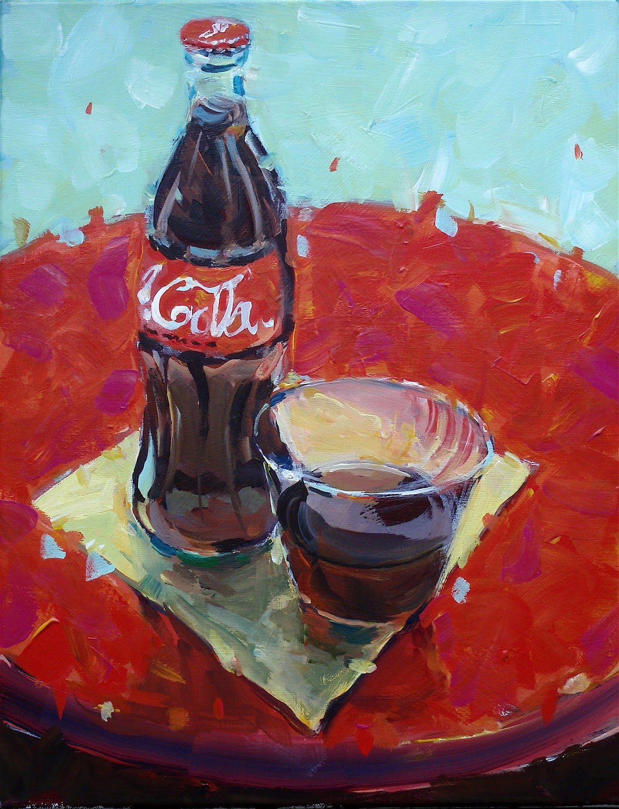
The Pause That Refreshes


Friday, February 17, 2012
Eucalyptus Road and Aspen Lane
These are two 11 inch by 14 inch watercolor paintings I recently did for my watercolor class at The School of Light and Color in Fair Oaks Village, California. 'Eucalyptus Road ' has a soft early morning- like atmosphere while "Aspen Lane" has a more hard edge, crisp feel. So why this difference?

 I used masking liquid to protect the tree trunks on the aspen as I was freely painting in the warm, Fall foliage. No masking was used on the eucalyptus trees, and I had to work carefully around the tree trunks. I also did my best to soften the edges of the foliage so that it blended in slightly with the sky. I think this helped to create a more diffused and softer early morning feel.


Monday, February 13, 2012
Two Bridges Just "Built" In Watercolor


Thursday, February 2, 2012
An oldie from the Lobenberg vault
When I watercolor and apply paint to paper I "miss" a lot of spots. These "missed" spots where the white of the watercolor paper show through are called "holidays". When seamen, during the days of sail, missed taring parts of the sailing lines, the captain would send them back up even on the Sabath to coat those missed areas, hence the name "holiday". Ever heard; "I haven't got a clue?" It is really; "I haven't got a clew".
 Clews are holes in the bottom corners of the various sails. Lines go through them to furl and unfurl said sails. If you haven't got a clew, you are in deep dew dew! I think the holidays in a watercolor painting give the image a beautiful sparkle and energy (click on this image to enlarge and see my holidays scattered about). Some blockheads out in the art world derisively call these missed spots "popcorn". Well, I know for sure that there is an extra special place reserved in Hell for such people, and they are indeed clewless!!!! Have a good day.

Subscribe to:
Posts (Atom)