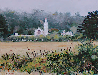
 In many of my workshops, we start out with my contour drawing that I make copies of and have my students transfer to their watercolor paper or canvas using Saral art transfer paper. My emphases is on painting technique and color mixing, not drawing. Last Saturday's acrylic landscape wrkshp. was the "Sisters By The Sea Sanctuary". Not only are my workshops part of my revenue stream (thought I'd throw in a little business speak), but they allow me a great opportunity to do multiple studies. I do a painting, whether portrait, still life, landscape, or abstract before my workshop in order to work out how I am going to teach. Then at the workshop, I do the painting again as my students follow my a step-by-step painting sequence. The final paintings either go to my galleries or end up in my annual holiday studio sale in December.
So here is my workshop iteration that I believe is an improvement on my first painting. I like the softer middle and backgrounds, the less fussy ochre field, and the less fussy yet more dramatic (in terms of light against dark tones) foreground. Overall this painting has more depth, because the middle and backgrounds are lighter and less rendered as compared to the foreground fence and brambles.
Tuesday, August 12, 2008
Sisters By The Sea Numero Dos
 In many of my workshops, we start out with my contour drawing that I make copies of and have my students transfer to their watercolor paper or canvas using Saral art transfer paper. My emphases is on painting technique and color mixing, not drawing. Last Saturday's acrylic landscape wrkshp. was the "Sisters By The Sea Sanctuary". Not only are my workshops part of my revenue stream (thought I'd throw in a little business speak), but they allow me a great opportunity to do multiple studies. I do a painting, whether portrait, still life, landscape, or abstract before my workshop in order to work out how I am going to teach. Then at the workshop, I do the painting again as my students follow my a step-by-step painting sequence. The final paintings either go to my galleries or end up in my annual holiday studio sale in December.
So here is my workshop iteration that I believe is an improvement on my first painting. I like the softer middle and backgrounds, the less fussy ochre field, and the less fussy yet more dramatic (in terms of light against dark tones) foreground. Overall this painting has more depth, because the middle and backgrounds are lighter and less rendered as compared to the foreground fence and brambles.
Subscribe to:
Post Comments (Atom)
12 comments:
Doing the same thing twice gives a new perspective, much like looking in a mirror at your work.
Had you not made a comparison yourself, the first one stood quite nicely.
It's always so informative and interesting to read the process of other painters, especially painters that are teachers.
Bonnie: Ye ole looking -at -your -art- in- the- mirror technique. The mirror ALWAYS gives an honest assessment (just like my wife). W. R. runs to read your comments and only walks to read mine ): A cute foot in the sand will do it every time!
I'm doing a portrait with Golden Open and will post it soon with my thoughts. I always appreciate your comments.
David- ( wr is too funny for one guy who can also paint)
I'm eager to see how you turn out a portrait.
I can absorb a lot from your posts, especially when you provide visual step by step pix.
I'm readying myself to post a WIP of an oil but reluctant until I'm happy with it.
It's now become a personal challenge ( and a $ deficit ) so I want to ride it for a while.
You probably noticed I haven't put much up recently- urgh! the learning curve.
i LIKE THis one very much and your comments are very informative.
Difficult to say which one I prefer.
It sounds like a very difficult piece-scene to paint anyway (details, depth etc)
Bonnie: Never ever give up even if you are not making much on the commission with all the added painting time. It's money in the bank in a manner of speaking. The more one paints, the better one gets, and you have an excellent artistic foundation to get better! WR is twisted, butt funny!
Helene: I think the difficulty lies in simplifying, and that is not always easy and I suppose is where the artistic magic comes in. Good to hear from you again. Is the island you live on in the Indian Ocean?
Helene again: How do I make comments on your blog? I don't see anything to click on.
Thanks David- your encouraging comment is so timely.
More than you know.
I'm with you in thinking this is an improvement over the first painting. It is a nice work. I like the simpler middle ground much better.
Bonnie should invite us to her island where we could paint that foot.
Thank you so much for your feedback, Onpainting. I'd love to paint that foot withya maybe accompanied with a nice cool one.
I'm chanting with the choir: they are both good, but the second version is indeed improved. The more muted background is more appealing and doesn't compete as much with the buildings. I also like the mood of this one - wonderfully eerie.
Bravo David! The piece is a success. Your comments and self critiques are wonderful to read. As they say in the painting world "Less is More". You have achieved it in the second rendering. I still like the first one very much but graying down the background and middle ground and changing some of the foreground shapes was in my humble opinion a better choice. I can learn much from your example!
Post a Comment