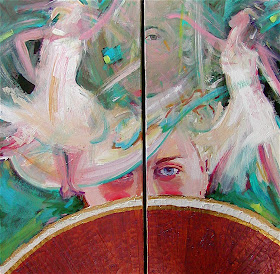

Several months ago, I wrote that I was commissioned in 2000 by the NBA Sacramento Kings to paint and design a poster to be printed and mailed to all the season ticket holders at the end of the season. A good friend and I spent three days at about three hours per day numbering and signing 7,500 prints in the executive office suite at Arco Arena here in Sacramento. In other words, my good buddy, Paul, picked up the first print from the stack and wrote 1/7,500 down in the left corner. He handed it to me, and i scrawled my signature next to the numbering. We finally finished at 7,5000/7,5000 followed by my 7,500th signature scrawl. Yes!...I added another fee for the numbering and signing!
But I digress. The 2000/2001 season was the Sacramento Kings best and most awesome season! They were the darlings of the sports media world and the fans! The following years and up to the present, the team has not played very well, because each and every season, they choose a new artist to do the end-of-the-season poster! If they had only stuck with yours truly!! As I mentioned several months ago, they hired me back this season to paint Chris Webber and Vladi Divac for two poster to celebrate the retirement of their jerseys at Arco Arena. They both played on the dream team of 2000-2001! I wrote that the team was going to turn around, because I was back on duty!!! But noooo!!!!!!!...they just ended the season as one of the worst teams of the NBA! So much for the Lobenberg art mojo!!!!
The bearded geezer on the right is me at the Divac jersey hanging game. The Kings played against the New Orleans Hornets. They lost by two points when a Hornet player sunk a three pointer in the last two seconds!!...bastards!

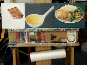
 And that someone is me! I teach at Sacramento City College, I conduct art workshops, I do my one fine art (at least I think it's fine). I also do commercial painting like you see here. This is one of a stream of steady food paintings I do for a graphic design firm that has many food related clients ranging from wineries, distilleries, and canned foods. They like my "illustrated" look for the food labels they design. At $300 per "spot Illustration", I'm affordable. Most every job is different. This allows me the opportunity to render a panoply of different things...good practice for an artist and the income stream ain't bad!
These three paintings will be used to print two different cooking broth labels. The chicken broth label will show the chicken plate with the ladle overlapping it a bit. The beef broth label, through the magic of the computer, will have the chicken taken off the plate and the beef placed on it. Same ladle but via said computer, the golden chick broth will be re-colored to represent beef broth.
I suppose a computer artist could do these illustrations, but either they haven't found a good one or none don't compete with my prices and reliability...who knows!
The other painting is for a label on a bottle of rum called "Hammock Bay Rum" I'm hoping to get a sample with my illustration on it. Sometimes painting becomes thirsty work don'tcha know?!.


